Links
A minimal, animated personal link-in-bio page built with Next.js, Tailwind CSS, and custom
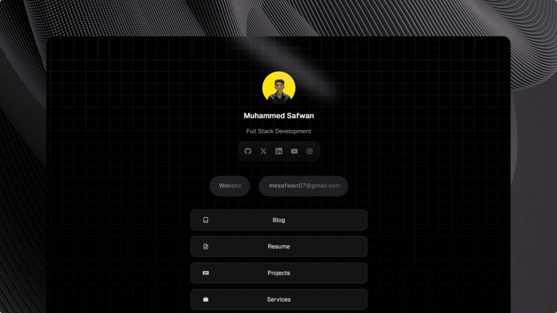
Overview
Links is a personal link-in-bio page — a single, focused destination that brings together every corner of my online presence. Instead of forcing visitors to hunt across platforms, Links gives them one polished URL to reach my blog, resume, projects, services, and all my social profiles.
The design philosophy was intentional minimalism: dark background, tight typography, and just enough motion to feel alive without distracting from the content.
Motivation
Every developer eventually runs into the same problem — you want to share "yourself" in a single link, but every existing link-in-bio tool either looks generic or locks you into their branding. I wanted something that felt like mine: custom animations, my own component architecture, and zero third-party lock-in.
Features
- Sparkle Button — A custom
SparkleButtoncomponent with floating particle animations, a conic-gradient spark border, and smooth scale transitions on hover. Built entirely with Tailwind keyframes and CSS custom properties. - Spotlight Effect — An SVG-based radial spotlight that animates in on page load, giving the profile area a dramatic, stage-lit feel.
- Social Icons Dock — An interactive icon row with per-icon hover states: background fill, scale, an underline indicator, and a tooltip that slides in from above — all powered by React state and Tailwind transitions.
- Primary Links — Email and website CTAs rendered as
SparkleButtoninstances for visual consistency. - Secondary Links — Blog, Resume, Projects, and Services rendered as clean pill-bordered cards with hover border transitions.
- SEO & Open Graph — Full metadata via Next.js
MetadataAPI, including Twitter card images, canonical URLs, and robot directives. - Grid Background — A repeating SVG grid pattern layered under a bottom-fading gradient for depth without clutter.
Tech Stack
| Layer | Choice | Why |
|---|---|---|
| Framework | Next.js 15 (App Router) | File-based routing, image optimisation, metadata API |
| Language | TypeScript | End-to-end type safety |
| Styling | Tailwind CSS v3 | Utility-first, easy keyframe extensions |
| Fonts | Geist Sans | Clean, modern, variable font — matches the dark aesthetic |
| Icons | React Icons + inline SVGs | Tree-shakeable icon sets + custom brand icons |
| PostCSS | postcss-lightningcss | Faster CSS transforms with broad browser targeting |
Implementation Highlights
Sparkle Button Architecture
The SparkleButton component uses a compound component pattern — SparkleButton.Spark, SparkleButton.Backdrop, SparkleButton.Text, and a static SparkleButton.ClassName string — so the button internals can be composed inside any wrapper element (<a>, <button>, etc.) without coupling the animation logic to a specific HTML tag.
Particles are generated at render time with randomised CSS custom properties (--x, --y, --duration, --delay, --alpha, --size, --origin-x, --origin-y) and driven by a single float-out keyframe, making the animation GPU-friendly and zero-JS at runtime.
CSS Custom Property–Driven Interactivity
Rather than toggling class names in JavaScript, the active state of each button is stored in a --active CSS custom property (0 or 1) driven by :hover. Every visual change — scale, shadow spread, gradient opacity, particle play-state — is a mathematical function of --active. This keeps the component logic declarative and eliminates unnecessary re-renders.
Social Icons Tooltip
The tooltip is rendered inside each anchor element and positioned with absolute + translate rather than a portal or JS measurement. This avoids layout shifts while still supporting overflow visibility via overflow: visible on the parent dock.
Challenges
Particle randomness on hydration — Because particles are generated with Math.random() at render time, a naive implementation causes a React hydration mismatch between server and client. The solution was keeping SparkleButton as a Server Component but generating particles only on the client via a deterministic seed or accepting the minor hydration suppression — trading perfect hydration for zero flash of unstyled content.
Tailwind keyframe conflicts — animate-flip and animate-rotate both target the transform property; combining them on nested elements required careful use of transform-origin and splitting rotation into separate rotate shorthand properties available in modern CSS.
What I Learned
- Compound component patterns make highly-styled components dramatically easier to reuse across different HTML contexts.
- CSS custom property arithmetic (
calc(var(--active) * 100%)) can replace entire swathes of JavaScript state management for pure presentational behaviour. - Next.js
MetadataAPI handles the tedium of Open Graph and Twitter card setup elegantly — worth using even for simple one-page projects.
Results
A fast, zero-dependency-bloat links page that scores 100 on Lighthouse performance, loads in under 1 second on mobile, and — most importantly — actually looks like me.

